
UGLY OLD HEIRLOOMS
Logo Illustration & Design
Here’s a peak behind the scenes on the entire process for the creation of this logo for Ugly Old Heirlooms. It was such a joy and an honor to work with Sarah on this very special project, and I was so happy to be able to help bring her vision for her logo to life!
The Brief:
I was extra excited to work on this project because the tomato Sarah had in mind for her logo had unceremoniously been chewed upon by some of her chickens before it could ripen! So, part of the illustration process would involve imagining the deep reds and purple hues of the ripe tomato, and then translating those into the painting.
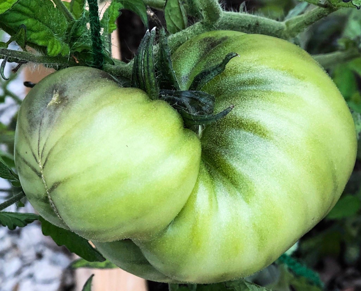
Tomato inspiration, pre-hungry chickens
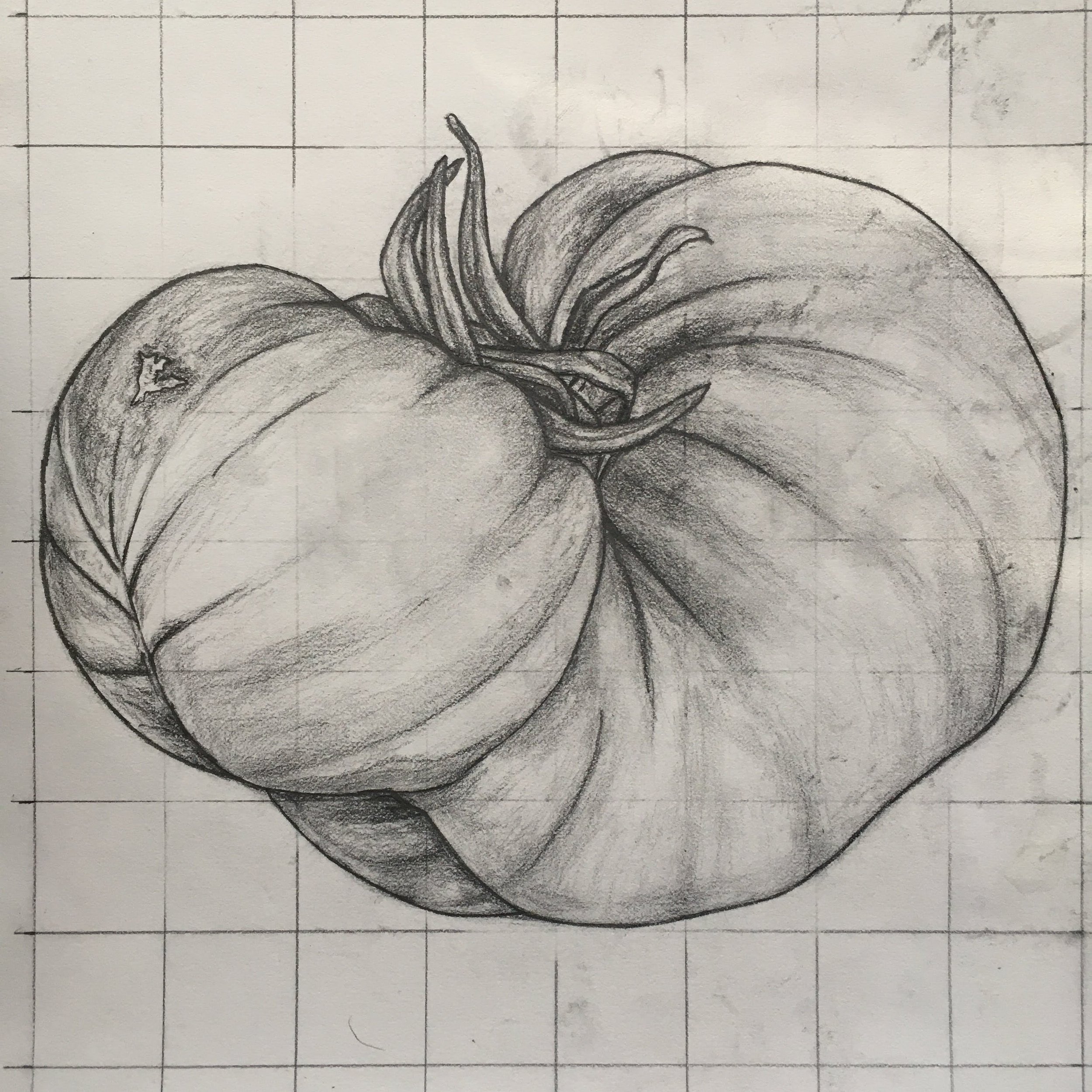
Pencil Sketch
The Prep Work:
The first steps were to research what a Cherokee Purple tomato would look like at peak ripeness. Sarah gave me the general colors (deep reds, brownish purples, and green around the center top), but I still wanted to gather lots of photo references to make sure I got it right!
Then, I created a pencil drawing of the tomato to help me work out the shading and values. I also created a small test painting to practice mixing colors and to show Sarah a proof-of-concept.
Digitizing the Artwork:
When the painting is finished, the only work I have left is typically either framing or mounting the artwork. However, with a logo design I still had to scan and edit the painting, add the lettering, and create the file deliverables (JPEG, PNG, PSD). As luck would have it, in a previous life, I was a freelance graphic designer!

Final painting